Trillium Art House
End-to-end brand identity and ecommerce design for a sustainably-sourced wood engraver community shop.

Client
Trillium Art House
Role
Brand Designer, UX/UI Designer
Scope
Logo Design
Brand Guidelines
Typography & Color Systems
Print Design
Ecommerce UX/UI
Timeline
March 2024 - June 2024
Overview
Trillium Art House is a sustainably-sourced wood engraver based in Windsor, Colorado, with a simple but powerful mission: to make products that evoke joy. Built around the ethos of giving artists a platform to craft with recycled materials, Trillium needed a brand identity that could carry that mission visually, from the logo to the storefront to the packaging it shipped products in. Everything had to feel natural, considered, and worthy of the values behind it.
Impact
Trillium Art House came away with a complete brand system built to grow with them. With a new logo, visual identity, brand guidelines, custom storefront, business cards, and packaging direction, everything worked together as one cohesive whole. This gave Trillium a brand that could finally communicate its mission at every touchpoint, from the first website visit to the moment a package arrives at someone's door.
The new brand launched with momentum, and within the first month, five artists had joined the platform and were displaying their work in the store. That number grew to 12 by the three month mark, and reached 18 by September 2024. Local artists saw a 15% increase in viewership and purchases of their work, without the overhead of running their own storefront. The website continues to serve as a hub for new work, artists, and events in the Windsor, CO community.
Logo & Icon Development
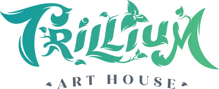
The Trillium Art House logo draws directly from the natural world: branching twigs frame the wordmark, and a trillium flower serves as the dot of the "i," grounding the brand in the botanicals its name references. The color palette pairs a mint with Persion green, striking a balance between earthy warmth and modern restraint.
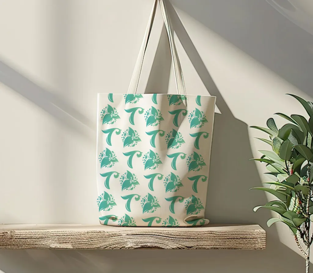
The sustainability mission ran through every brand decision. Print materials and packaging were produced on recycled paper and cardboard wherever possible, and the brand extended to recycled fabric totes. Even with limited options dictated by the recycled materials themselves, the constraint became part of the story rather than a limitation to work around.



Typography, Color, and Brand Guidelines
Trillium Art House's visual identity is grounded in a palette that feels as intentional as the materials the brand works with. A greenish turquoise paired with a blue-gray strikes a balance between the warmth of the natural world and a modern restraint that keeps the brand from feeling rustic or dated. Together they communicate Trillium as earthy and contemporary, handcrafted and considered.
The typography follows the same philosophy, chosen to complement the organic quality of the logo without competing with it. Clean enough to feel professional, characterful enough to feel human.

Persion Green
RGB 0 / 154/ 155
Hex 009a9b
CMYK 81 / 19 / 42 / 1
Dark Mint
RGB 82 / 185 / 130
Hex 52b982
CMYK 67 / 1 / 66 / 0
Tumbleweed
RGB 209 / 166/ 145
Hex d1a694
CMYK 18 / 36 / 39 / 0
Mid Grey
RGB 88 / 98 / 110
Hex 58626e
CMYK 68 / 55 / 44 / 18
Pearl Brush
RGB 234 / 221 / 211
Hex eaddd3
CMYK 7 / 11 / 14 / 0


Physical Touchpoints
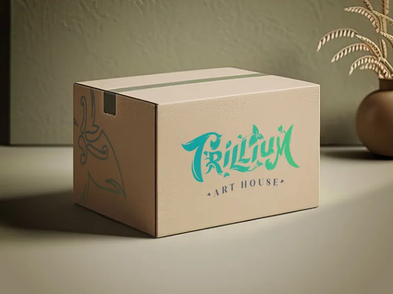
A brand isn't just limited to screens, it's what arrives at someone's door. For Trillium Art House, that meant extending the visual identity into the physical world with the same level of care and intention behind every other design decision. The branded recycled cardboard box and fabric tote carry the Trillium identity into the hands of real customers, reinforcing the sustainability mission when the product is unwrapped for the first time. The business cards follow the same ethos, designed to feel as considered and crafted, leaving a lasting impression long after the first meeting.

Ecommerce Storefront
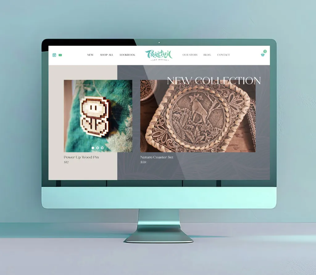
The Trillium Art House storefront was designed to serve two types of customers: those browsing ready-made pieces, and those looking to commission something custom. A dedicated gallery section gave featured artists their own space to showcase their work, turning the storefront into something closer to a community platform than a standard shop. The design carried the brand's natural aesthetic throughout, ensuring the online experience felt as considered and handcrafted as the products themselves.